“A brand is much more than just a logo” or so the saying goes. While this is undoubtably true, the logo is a key part of a brand with a hugely important role to play in building brand recognition and loyalty.
Logos make people think and feel
The word logo, abbreviated from ‘logotype’, comes from the Greek words ‘lógos’ (word, speech), and ‘túpos’ (mark, imprint). Logos are symbols that represent something – a person, organisation or business – and should communicate an idea or instil a feeling that the creator has hoped for. Despite the complexity of the human mind, a simple idea or a direct appeal to your emotions cuts through more effectively than one that requires more mental gymnastics to understand.
Today’s brand landscape is seeing a global trend towards the simplification of logos, although some say that chosen method is less of a design trend and more of a common solution to a universal problem.
So why keep things simple? There are two interlinked reasons for this – one philosophical, the other entirely practical.
It creates a clearer core message
The first reason comes about through the marketers’ long-standing wish to simplify the message. Removing clutter, like shortening copy and reducing the amount of imagery makes the idea clearer and helps the consumer ‘get it’ quicker. And so, the brand is judged to be more successful.
This same process is going on in branding too – removing all unnecessary details until only the central ‘core’ idea remains. Once a logo has been around a few years or decades, it seems more and more of its detail, its decoration, is seen as unnecessary.
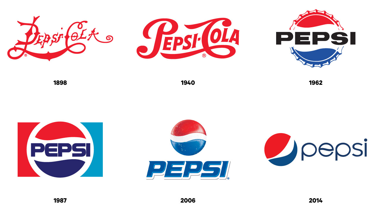
The evolution of the Pepsi logo
It makes practical sense
The second reason is because of the many places logos now have to exist in and still create impact. Brands show up on multiple different screen sizes and digital spaces, so their logo needs to be flexible enough to scale up and down without losing its identity. Complex logos with rich, multi-tonal colour, fine details and small type locked-up within it are no longer fit for purpose in this new digital age.
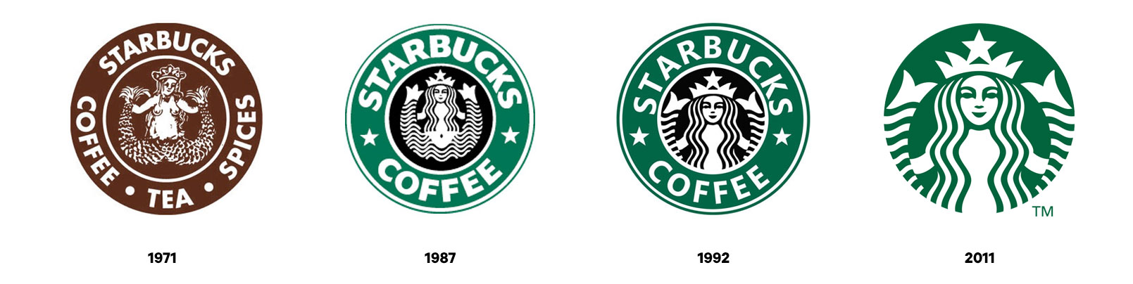
The Starbucks logo through the years
Have we seen this all before?
It does seem that this process is cyclical. Many company logos followed the same evolution throughout the 20th century. Starting off full of complex details in the early years, brand marks were gradually refined into those iconic logos we all recognise.
Iconic 20th century logos from designer and father of streamlining Raymond Loewy
Then along came Photoshop in February 1990 and logos went back to being complicated again. The 21st century buzzword was skeuomorphism, where designs would mimic the appearance and textures of real-world materials. This design strategy was particularly popular for software and applications in the digital environment, but also made its way into the automotive sector.
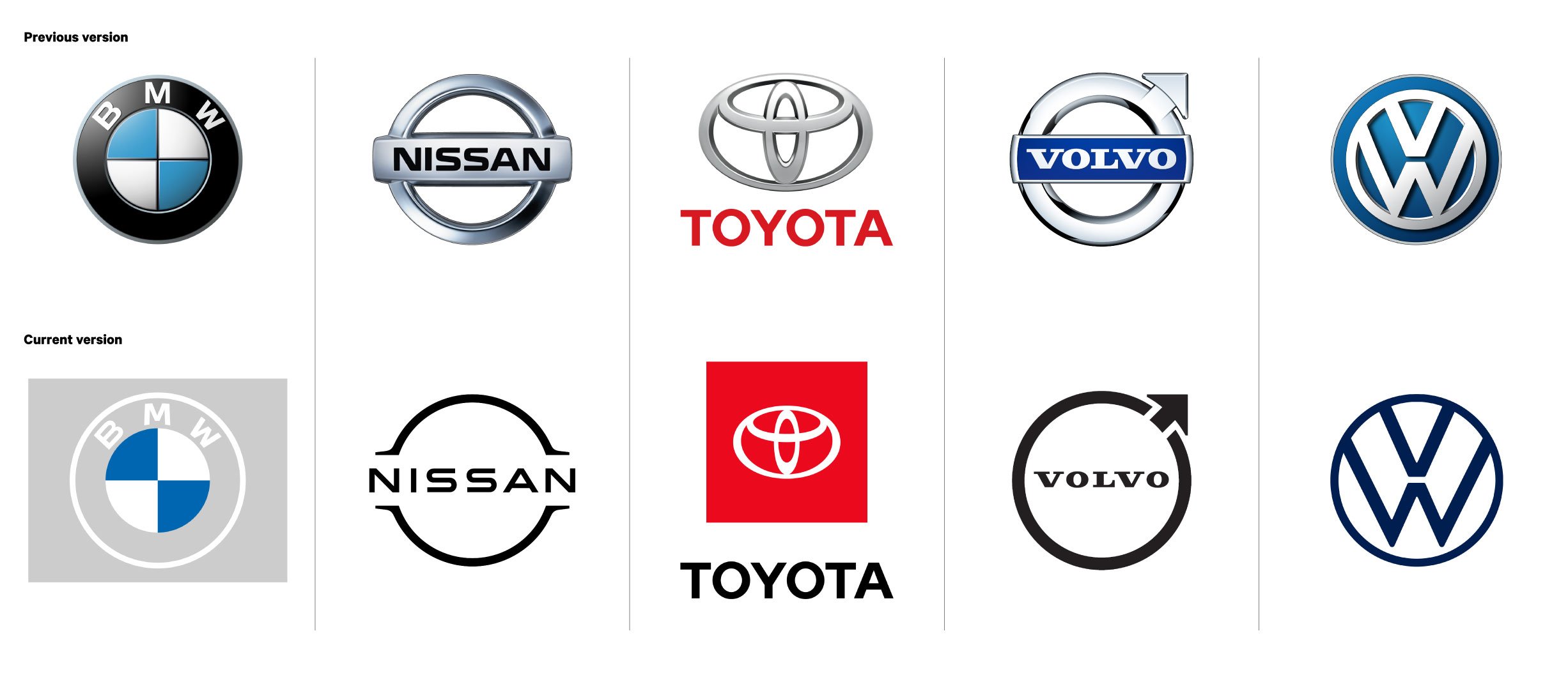
Automotive brands collective move towards simplicity
The pathway to simplicity
In yet another reversal, and at a time when the term ‘multi-platform’ meant more than ‘works on both Mac and PC’, logos again became flatter and simpler as they had to work harder to be effective on a variety of screen sizes and applications. ‘Flat design’ as it’s now called is leading the way into a simpler, more minimal future. Well, until the next breakthrough changes everything again.
“If you look at the stories of logos, from 3M to Windows to Audi, often what you see is that in the past the logo was very simple and then it got complicated in the middle and then it was simplified again. You realise you had the answer the whole time.”
Dan Beckett, head of design, The&Partnership