"The grid is the underwear of the book" – Massimo Vignelli
It can feel pretty terrifying starting out on a new project. Most of us can identify with sitting in front of a blank page not knowing where to start. How to arrange everything so it’s nice to look at, but also clear to read.
How big should the pictures be? How many on a page? What size should the body copy be? The endless possibilities can be overwhelming and stunt the creative process from ever getting off the ground. Grid systems can bring a much-needed structure to the chaos.
Grids were first used to quickly reproduce print
Beginning in the early days of mechanical type, grids were first used to efficiently reproduce books, newspapers and magazines. This continued into the 20th century and really came into its own with movements like The Bauhaus and the Futurists who experimented with the form within the constraints of the technology.
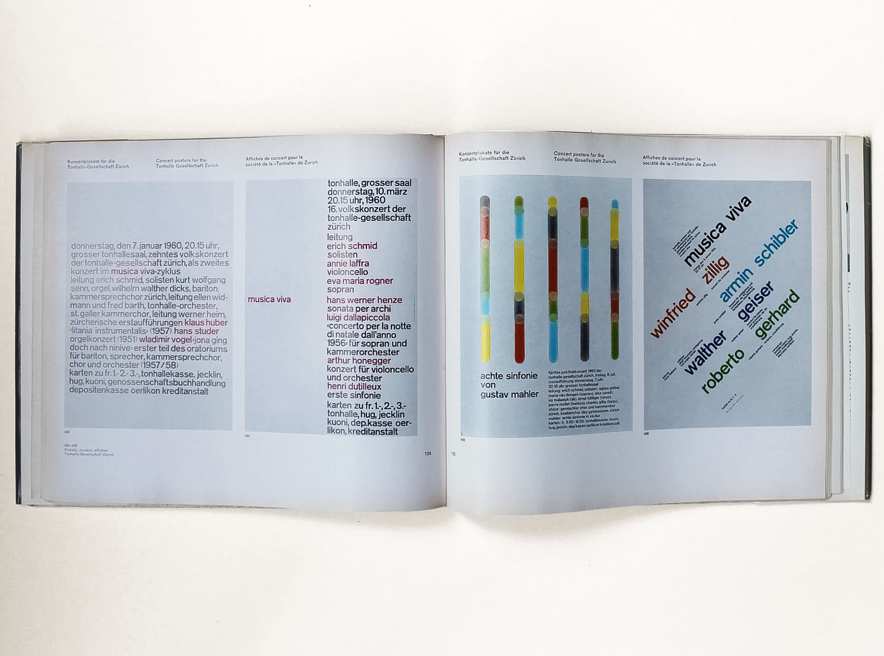
This experimentation was built on and further formalised by the Swiss School of graphic design creating many of the fundamental visual systems we know today.
They provide a set of parameters for ideas to flow
Most communications comprise of text and imagery, and grids help you bring these elements into a semblance of balance and structure. It is these constraints that can cause creativity to blossom by reducing the number of options but at the same time opening up an array of possibilities.
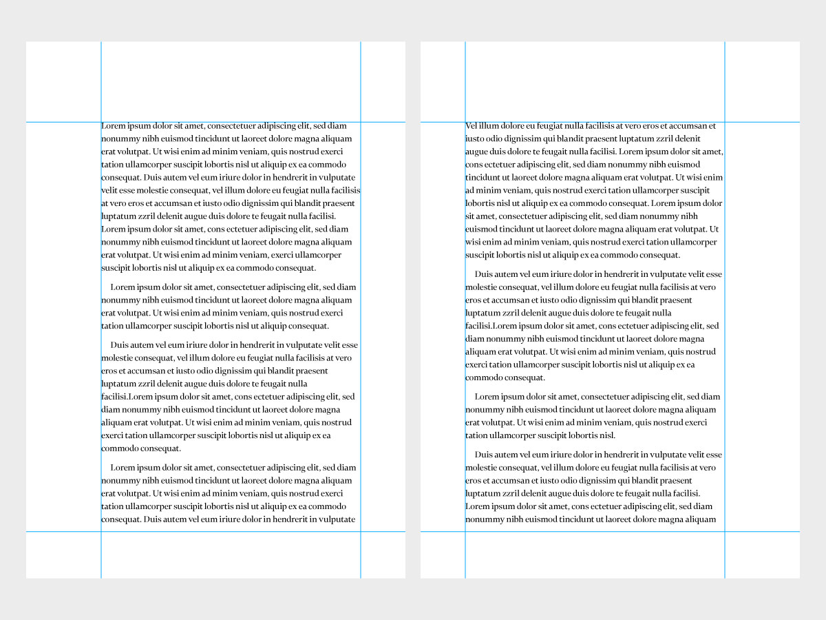
Although developed during the age of print, grid systems have become a fundamental tool of digital design too. Grids can be as simple as a defined outer margin with a single text field:
Simple grid
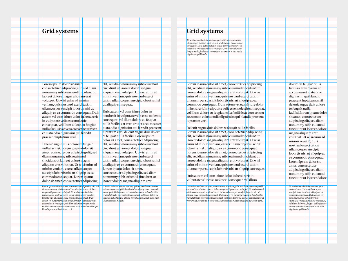
To complex multi-column layouts with horizontal baselines and a hang line or two for good measure:
Complex grid
Put this together with design principles like the rule of thirds or the golden ratio (more on these in future blogs), as well as beautifully written copy and fantastic imagery of course, and you’ll find that layouts become more rhythmical, more engaging, more pleasing to the eye.
They help with people’s understanding
Publishers, editors and designers work hard to adhere to these rules, not only because they’re accepted as the tried-and-tested best way, but for another more person-centric reason too. The audience expects to find everything in its proper place. Move things around too much or make things too random and confusion sets in.
Grids establish visual hierarchy which helps draw attention to the most important components of the design. They aid in getting your message across in the clearest, most intuitive way possible, resulting in supremely effective communications.
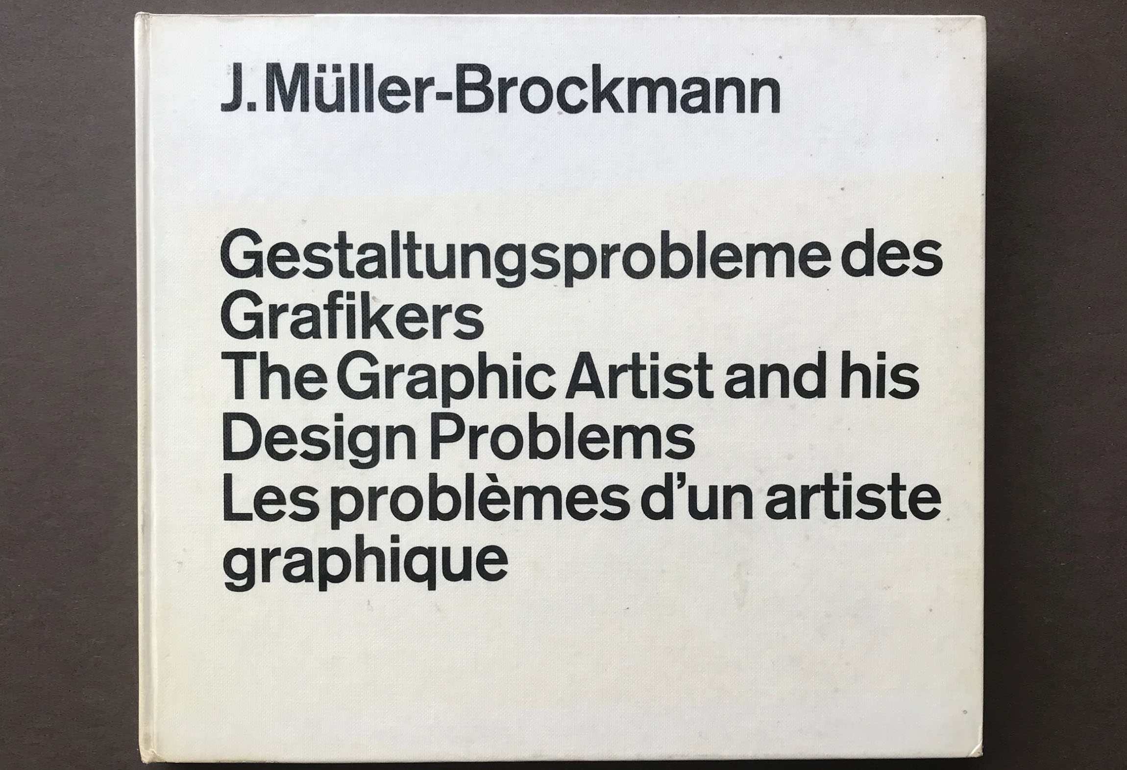
As Josef Müller Brockmann wrote is his book The Graphic Artist and His Design Problems:
“The grid makes it possible to bring all the elements of design — type characters, photography, drawing and colour — into a formal relationship to each other; that is to say, the grid system is a means to introducing order into a design. A deliberately composed design has a clearer, more neatly arranged and more successful effect than an advertisement put together at random.”
Don’t be too strict – it’s all about finding the right balance
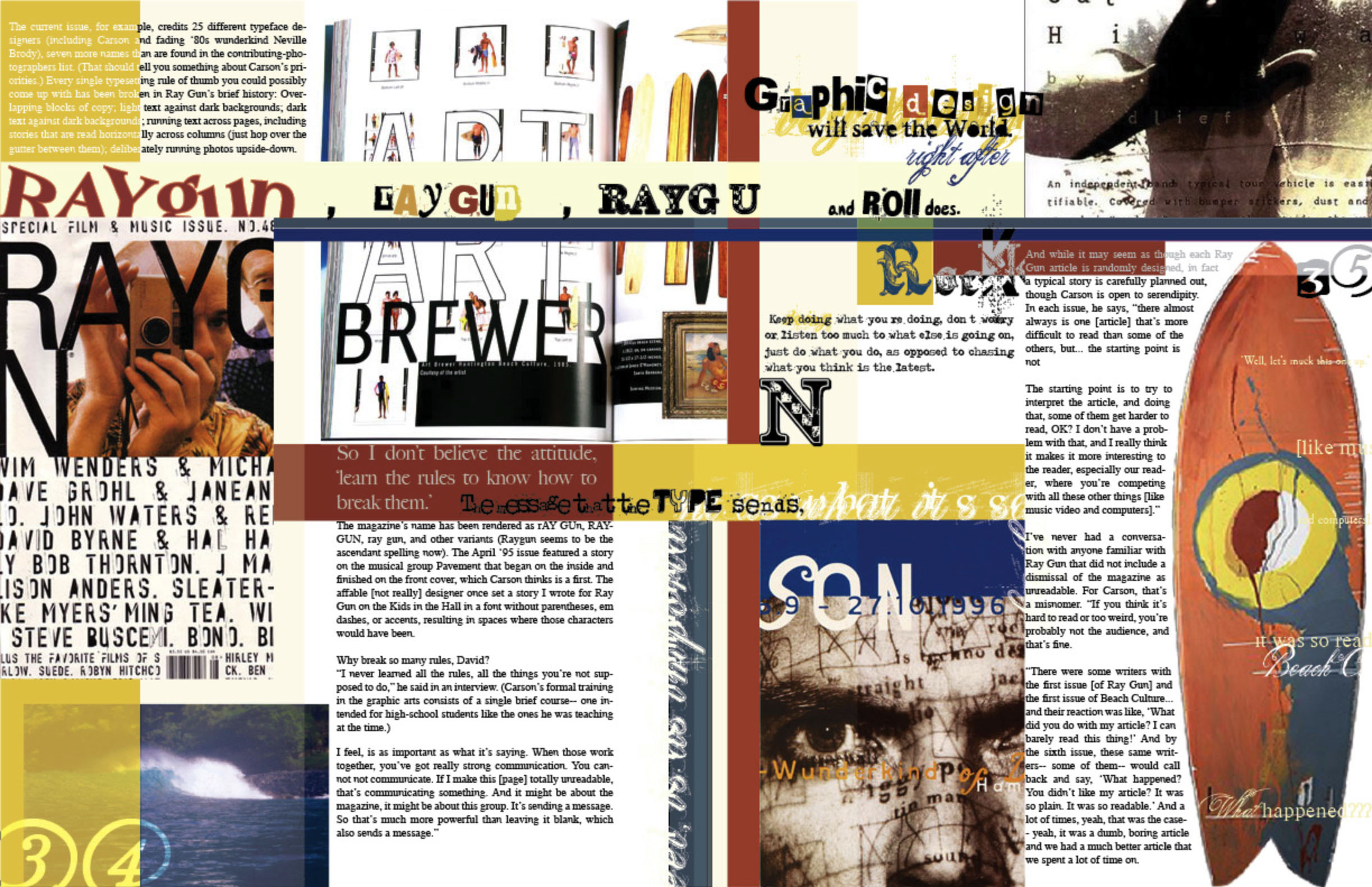
Of course, grids are not mandatory. Some of the most influential designers in history, such as David Carson, consciously avoid them for a more emotional, freeform and intuitive approach.
As with most things, ultimately it’s about balance. Sticking too strictly to grid rules will result in uninspiring, homogenous layouts. Too far the other way and you could end up making a design so impenetrable you risk losing everyone all together. Find that happy medium and your designs will be well on the way to success.
Stay tuned for more design 101 features
Next up in our Design 101 series is 'Creative concept', so make sure to follow us on LinkedIn to catch the next instalment.